Showing posts with label purple. Show all posts

The Polish Well: BANG!


Happy Sunday everyone!
I can't believe the long weekend (we had 2 days of public holidays on thursday and friday) passed by so quickly. I still don't feel adequately rested! T_T

Anyway, I thought I would share some of my new concoctions on the blog today. It has been quite a while but I've finally finalised a new collection that is based on one of my favourite korean bands - Big Bang! I was introduced to Big Bang by my sister earlier this year and have since been hooked onto quite a number of their songs. The idea of a collection came about way back in March when I had a sudden bout of inspiration and created Hallelujah. Since then, I have mulled over the rest of the colours and I am happy to say that I've finally made some headway. Take a look:

p.s. you can click on the lyrics to enjoy the lovely songs on youtube :)


Fantastic Baby.
A berry red jelly filled with an assortment of glitters - holos, reds, purples, circles, squares, hexes and a sprinkling of shimmer. I had such hard time coming up with a colour for this song. Every ounce of my instinct told me to throw a bunch of silver holo glitters together for the dance number but I wasn't sure if I could come up with a mix that is better than what is already available in the market. In the end, I scoured through the lyrics and settled on "heartbeat" for my colour inspiration. Even then, it took me several tries before I came up with this. Quite happy with the squishy look. :P


Ego.
Red with gold and holo shimmer. Slightly darker than what it looks in this picture. Unfortunately, I didn't manage to capture much of the shimmer in the picture either - it is slightly more visible IRL :(


Love Dust.
A soft greyish-blue mint with subtle holo. This was partly born from my obsession with turquoises and mint and partly from Deborah's (lovevarnish) request for a soft mint holo. I took a look at the bottle after the shaking and mixing and "Haru Haru" immediately came to mind.


Monster.
A sage green with rose flecks and subtle green shimmer. This is not new to the blog and some of you might already know that this was from my feeble attempt at duping Butter London's Two Fingered Salute. I've since gotten my hands on the real deal and they are definitely not dupes. While the base colours are almost, if not exactly, identical, the shimmer and flecks are completely different. Nonetheless, I really like this lab creation and it seems to fit with the song so I've decided to keep it in this collection. :P


Lies.
A deep teal with a mix of aqua blue and green shimmer. Another song that gave me a difficult time but I am glad I finally had an eureka moment.


Bad Boy.
A deep blue with a mix of copper, blue and purple shimmer. This was another song that was very challenging to put in a bottle. In the end, I went with the colours of a beautiful sunrise that I happened to catch. I think this one needs a bit more shimmer for the colours to pop.


Tonight.
A deep plum jelly with gold, royal blue and purple shimmer-flecks. This was an accidental mix that came about because I was curious what I would get if I mixed all my shimmers together. I didn't go further than these three colours when I fell in love and abandoned my initial quest. I will toy with that again in future - though I suspect it may not look fantastic.


Hallelujah.
A mix of holo silver, gunmetal and lavendar glitters and with a smattering of purple shimmer falling within the depths of the black jelly. My very first colour of the collection and one which I still love.


Blue.
A slate grey with blue, green and silver shimmer. Inspired by the very first Big Bang song that I fell for. My sister had been playing Big Bang songs for ages but this was the very first that caught my attention. Unlikely most other korean songs that my sister played, this was unusually mellow and emotional. Till now, it is still one of my favourite songs by Big Bang so there was no way I could leave this song out. 


Phew. That was quite a whole lot of polishes, wasn't it? 
Now that you've seen them, which one(s) caught your eye?

As you might have noticed, I have temporarily placed my shop on hiatus and I am no longer taking any orders at the moment. Although I've enjoyed creating these new colours, I have yet to firm up any plans for my store so these polishes (together with the other colours) are not available for sale at the moment. I will post an update once I have a plan. 

So why am I showing these new colours to you, you ask? 
Well... apart from the fact that I couldn't wait to show you my creations, I've also decided to throw a small giveaway to celebrate my birthday this week! ^_^

The prize? The entire unreleased BANG! collection (minis) for one lucky winner!

The giveaway is open on this blog (details in the rafflecopter widget) and on Instagram (details on my IG post). All entries will be collated for the draw so you need not enter twice - duplicate entries will be deleted before the draw.
The usual rules apply so fire away!
Giveaway closes in a week's time on 18 August 2013 at 12am, SGT. Good luck!

Giveaway has ended


 photo xoxo_zpsaad7ebe5.png

piCture pOlish Blog Fest 2013: Celebrating the Year of the Blogger!


After an agonising month of keeping my mouth sealed, I am happy to say that the day has finally come! Yup! It is time for piCture pOlish's Blog Fest 2013! For those who are new to the scene, piCture pOlish hails from down under and every year, a group of bloggers embark on a massive mission to swatch and showcase new colours from piCture pOlish for polishaholics to drool over. Well, at least that was what happened in the past...

This year, the girls from piCture pOlish decided to catch us all by surprise by having a huge competition instead to celebrate the Year of the Blogger! Yup! They have dedicated this event for all the bloggers and to celebrate what we do ♥ I must say, I was rather surprised and touched when I first heard about the theme for the blog fest this year. I might have mentionned it before but I think there are still many people out there who have the impression that nail blogging is a piece of cake. It looks deceptively simple but bloggers often put in a lot of effort to maintain their nails, painting them as perfectly as possible, photographing them accurately, editing the pictures and finally blogging about them - all these on top of living a regular everyday life (yes, we really do engage in other activities apart from painting our nails). For me, it has become slightly more challenging this year when I took on a full-time job after my graduation. I am often bone-tired after work and there were several occasions when I felt like throwing in the towel so that I can rest a little more during the weekends... but your comments kept me going, so here I am! ♥

So, before I digress further and get all soppy, let's talk about the competition, shall we? On 29 July, 7pm, local time, participating bloggers will showcase their own nail art creation to take part in the competition. All nail art creations will go into the running to be chosen to.... create a collaboration shade with piCture pOlish!! *excited dance* There are only three winners though - 1 voted by all of you, 1 voted by the participants and 1 chosen by the girls from piCture pOlish.

For this competition, I was given these three shades to work with:


Stunning, aren't they? I will post swatches of each of them but first... let's take a look at what I came up with. After wrecking my brains out, I've decided to unleash my inner Pollock to create this mani:


If you have been following me for a while, you would probably know that I can't really draw to save my life. And you should also know that it doesn't stop me from doing nail art ;) After all, there are plenty of nail art techniques that are really simple and idiot-proof! This is one of them. All you need is some pretty colours, a fan brush and follow these steps:


  1. Start the manicure with a coat of base coat to protect your nails.
  2. Paint your nails with a coat of white as the base colour and let dry.
  3. Drop a drop of polish on a piece of paper.
  4. Dab the fan brush lightly against the drop of polish so that the tips of the brush pick up some polish. You would want only a small amount of polish to get a streaky brushed look. 
  5. Run the fan brush down (or up) your nails to get streaks on your nails.
  6. Repeat steps 2-4 with other colours.
  7. Once satisfied, seal the design with top coat and you are done! (Clean up required, of course)

Because the design is really simple, you are free to use any colours that you like. Personally, I think analogous colours with a splash of complementary colour work very well to create a striking combination. If you like some texture, you may use varying shades of the same colour or make use of slightly sheerer colours to create the illusion of depth. The trio from piCture pOlish were perfect for this and that was one of the main reasons why I went with this design. 

Now for swatches of each of the colours:

picture-polish-flirt

Flirt. 2 coats.
A bright magenta that certainly deserves that warning label on the bottle. And yes, it is more flirtatious than sweet so bring it on ;)
Before I forget, this hawt babe is a one-coater that applies itself. Super fantastic formula.

picture-polish-violet-femme

Violet Femme. 3 coats.
A deep bright purple that is slightly sheer but builds up to opacity nicely. Dries to a matte-satin finish - I think it really does have neon pigments! - so a top coat is definitely needed. I really love this shade of purple.

picture-polish-kryptonite

picture-polish-kryptonite2
Kryptonite. 3 coats.
Now this is my kind of kryptonite. A deep dark green with chunks of holo particles and shimmers. Wonderfully shimmery and mysterious in the shade but all glowy and sparkly then it catches the light. You absolutely need to click through on the picture and look at the details in the original reso. I did not manage to catch the holo action but trust me, the chunky particles swimming in the dark green base is enough to make you weak all over too - well, maybe except the nails, they will be superhuman.


piCture pOlish is available on their webstore (everyday deals and international shipping available!) or through their network members. You can also follow them on Facebook, Twitter, Pinterest and Instagram for more updates.


 photo xoxo_zpsaad7ebe5.png

**Products were provided for contest participation. All views expressed are our own honest opinions. Please see our disclosure policy for more information.**

China Glaze: Sunsational Jellies


Finally, the second half of the China Glaze Sunsational Collection - the jellies!


As you may have already heard, some of the jellies are quite sheer so I chose to layer all the colours over white in my swatches below.

china-glaze-isle-see-you-later

Isle See You Later. 4/5 coats over white.
A blue jelly. The sheerest of the whole collection. It is so sheer that I wouldn't advise you to try getting it to reach opacity on its own. Because it is so sheer, the blue does not come across as deep as it looks in the bottle. Nonetheless, it is a gorgeous bright baby blue on the nails when layered over white.

china-glaze-keepin-it-teal

Keepin' it Teal. 4 coats over white.
A green-leaning teal jelly that is also on the sheer side but slightly better than Isle See You Later.

china-glaze-shell-o

Shell-O. 4 coats over white.
A coral orange jelly that screams fluorescent. With my thing for corals at the moment, it is no surprise that I really like this one.

china-glaze-heat-index

Heat Index. 3 coats over white.
Bright hot pink jelly. Very aptly named. Hmmm... I think the next time I will add another coat or two to get closer to the bottle colour. I am surprised that I quite like this one.

china-glaze-you-drive-me-coconuts

You Drive Me Coconuts. 3 coats over white.
A relatively more muted pink with blue undertones as compared to Heat Index. It is still very bright though. The formula is one of the better ones in this half of the collection - I suspect it can actually reach opacity on its own.

china-glaze-are-you-jelly

Are You Jelly? 3 coats over white.
Another bright purple! It is also more opaque but the formula is a little patchy.

Now that you've seen all the swatches of the China Glaze Sunsational collection, which ones are your favourite?
(psst! If you've missed out on my previous post, you can check out the first half of the Sunsational collection here.)

On the whole, formula aside, I must say I really enjoyed the colours that China Glaze has put out for this summer. I am especially in love with the cremes. Because of them, I am officially a neon convert now. No kidding, even as I type, I am wearing some of them as a gradient on my toes - no worries, I won't be posting pictures of that. ;)


 photo xoxo_zpsaad7ebe5.png

**Products were provided for our honest review. Please see our disclosure policy for more information.**

China Glaze: Sunsational Cremes


Hola!! After enduring a terrible work week, I thought I would chase away all my sorrows and brighten up my weekend with some neons (pun completely intended)!

Despite all the hype over neon colours in the polish community, I have always avoided neons because I found them too stark and too eye catching for my taste... that is, until I saw the promotional pictures of China Glaze's neon releases for summer 2013. The pastels called to me and my eyes were immediately drawn to the blues and greens. I knew I had to have them. And I was right! Take a look:


Disclaimer 1: I've tried my best-est of best-est to get colour accurate pictures but my camera just refused to handle so much awesomeness. They are brighter in person.

Disclaimer 2: I did not go for any tanning session. The neons are so bright that my camera (and even my eyes) decided that I must have become tanner some what. Silly them.

china-glaze-too-yacht-to-handle

Too Yacht to Handle.
Yup, this is a almost-neon sister of the famous For Audrey. It looks identical to For Audrey but when you put them side by side, you will notice the difference immediately. Too Yacht to Handle is a bajillion times brighter and For Audrey looks really dusty in comparison. Too Yacht to Handle also comes across as being slightly greener. Both are gorgeous in their own right.

china-glaze-highlight-of-my-summmer

Hightlight of My Summer.
A yellow-leaning pastel mint green. I really like it more than I'd expected. It is really bright. I'd thought Illamasqua Nomad is bright but it pales next to Highlight of My Summer. Nomad also has a tinge more blue than Highlight of My Summer. Yup, I do love these two colours.

china-glaze-sun-of-a-peach

Sun of A Peach.
An eye-searing neon peach. Ughhh I love this so much - unexpected favourite. Awesome colour with an awesome name to match. Just plain awesome. I wore it when I dropped by my workplace during my call break (needed to settle some personal matters) and my friend was completely blown by how fluorescent my nails were. Yup it is that bright.

china-glaze-neon-on-on

Neon & On & On.
A neon pink with just a touch of coral. I thought I wouldn't like it but the coral is making me mince my words. Also an unexpected favourite.

china-glaze-bottoms-up

Bottoms Up.
A neon bubblegum pink with a touch of blue. I am sure this would grace Barbie's nails during summer.

china-glaze-thats-shore-bright

That's Shore Bright.
A bright red-leaning purple. The least neon of the collection - is it a neon? Nonetheless, it is still a fun summery colour to sport.

Now, you may have already heard of this already. The formula of these colours are not the nicest to work with. They apply streakily and do not level on their own. I suspect the white in the pastels is not playing nice - as usual. I found that it helped a little to use piCture pOlish's Revolution (meant to be a glitter base but it did not work as well as I had hoped it would be) - the colours applied less patchily that way. Seche Vite did wonders to level out the streakiness as well.

Nonetheless, I am really head-over-heels in love with the sunsational cremes. I liked that they are not the usual highlighter colours. They look less stark that way, don't you agree?

Ever since I have received them in my mail, I've pulled them out countless times to wear them one way or another. Just before I came back to work, I did this completely work-inappropriate mani just because I can ;)

nail-art-china-glaze-sunsational

I started with a white base and randomly sponged on the colours from the Sunsational cremes before topping them with a coat of black shatter. Oh yes, shatters do look good once in a while ;)

So what do you think of the Sunsational cremes?
My personal favourites are Sun of a Peach, Too Yacht to Handle, Highlight of My Summer and Neon & On & On... ok. That's not really helping :P
Which colour is your favourite?

Stay tuned for swatches of the other half of the collection ♥

 photo xoxo_zpsaad7ebe5.png

**Products were provided for our honest review. Please see our disclosure policy for more information.**

essence: Spring / Summer 2013


Happy Sunday everyone! ^_^

I'm feeling particular exuberant today because the air in Singapore has cleared up somewhat in the last two days! The past week had been absolutely horrible. Fires raging in Sumatra caused a huge haze in Singapore with the PSI readings hitting the hazardous range for the first time in years. I have been shuffling to and fro work with a mask because the haze (oh the burning smell!) was giving me a tremendous headache. So I am really relieved that we have some brief respite over the weekends - finally some remotely breathable air! Of course, it would be even better if the government could declare a stop work order next week... yea, I've been told that I am too optimistic :(

Anyway, back to the polishes!

essence Singapore has recently brought in some new shades for spring and summer and they have most generously sent them over for me to share with you. I don't have much to say except that these colors are simply perfect springy/summery shades! Take a look:


essence-ice-ice-baby

Ice, Ice Baby! 4 thin coats.
A squishy off-white jelly that is slightly tinged beige. A little streaky on the first 2 coats but evens out to a perfect glossy finish. It didn't really need the top coat but I top-coated it anyway to speed up the drying process.

essence-peach-cream

Peach & Cream. 3 thin coats.
A soft peach puff with slight pearly shimmer. The pearl finish is not that obvious on the nails after 2 coats so that's a big plus for me - I am not really a fan of that finish. I did not think the color was very flattering on my skin tone under some lighting but I wore it for a few days anyway because it went well with my new turquoise phone casing! :P

essence-thats-what-i-mint

That's What I Mint! 3 thin coats.
A soft pastel mint with very very slight green shimmer (that is clearly not visible on the nails). You know my obsession with blue-greens - this was instantly my favorite. Of course, I wore it for a few days because it matches my phone casing too! ;) It is a tad lighter than China Glaze's For Audrey and they will make a good ombré manicure - I just need to find 3 more shades of turquoise / mint... See! That's why I need more shades of this color in my life. *nods solemnly*

essence-hello-marshmellow

essence-hello-marshmallow2
Hello Marshmallow! 3 thin coats.
A delicate lilac with sprinkles of red and blue shimmer. The shimmers are not that visible on the nails but you can catch a few glimpse of the elusive shimmer where the light hits the nails. It is significantly less similar to China Glaze's Light As Air than I'd thought - more purple and brighter.
essence-flashy-pumpkin

Flashy Pumpkin. 2 thin coats.
An eye-searing tangerine orange. It is so bright that I would even call it neon. Super summery but definitely not for the faint-hearted. Formula for this was exceptionally good. It is very pigmented and I suspect you can get away with one thick coat.

essence-prom-berry

Prom-berry. 2 thin coats.
An intoxicatingly rich vampy purple with very subtle red and blue shimmers. The shimmers are not obvious on the nails but they give the nails a slight glowy look when the nails catch the light.

essence-miss-universe

essence-miss-universe2
Miss Universe. 1 coat over black.
A sheer black base filled with intense sparkly blue and green microflakies.   It is very sheer and will need about three to four coats for full coverage on its own. Very similar to Zoya's Kotori except that it has that extra oomph from the bright green sparkles. Needless to say, I am head over heels in love with this too.


Overall, I am extremely happy with the new colors. The colors, brush and formula do not disappoint. As always, the pastels are slightly streakier than the other colors but they even out fairly nicely on the third coat so I have no complaints there. Plus, at only S$2.90 each, they are a steal - definitely one of my favorite affordable brands.

So, which colors caught your eye? :D

essence cosmetics is currently available at these Watsons stores: Ngee Ann City, City Square Mall, Causeway Point, Lucky Plaza, Plaza Singapura, Bugis Junction, Sun Plaza, JEM, JCube, Parkway Parade, IMM, Lot 1, Anchor Point, Rivervale Mall, Park Lane, Bedok Central, Beautyworld Centre and SMU.


 photo xoxo_zpsaad7ebe5.png

OPI: Pirates of the Caribbean - On Stranger Tides


So, I'd lost my blogging mojo for a few weeks. To be more accurate, I actually bordered on losing interest in nail polishes altogether. Terrifying, I know... But there are many reasons that drove that crazy idea into my head - work, filling orders from my Etsy store and my stubborn insistence to indulge in my other hobbies (eg. manga, TV dramas) till late in the night. With so many things to do, I hardly found the time to do swatches / nail art for the blog *hangs head in shame*

This went on for a few weeks and I finally decided to do something about it:

From now on, my Etsy store will only be opened on the first and last 3 days of each month. 

I thank you for your understanding. Hopefully, this will give me more time over the rest of the weekends to recharge and spend time on other things that I love too - including updating this blog! ♥

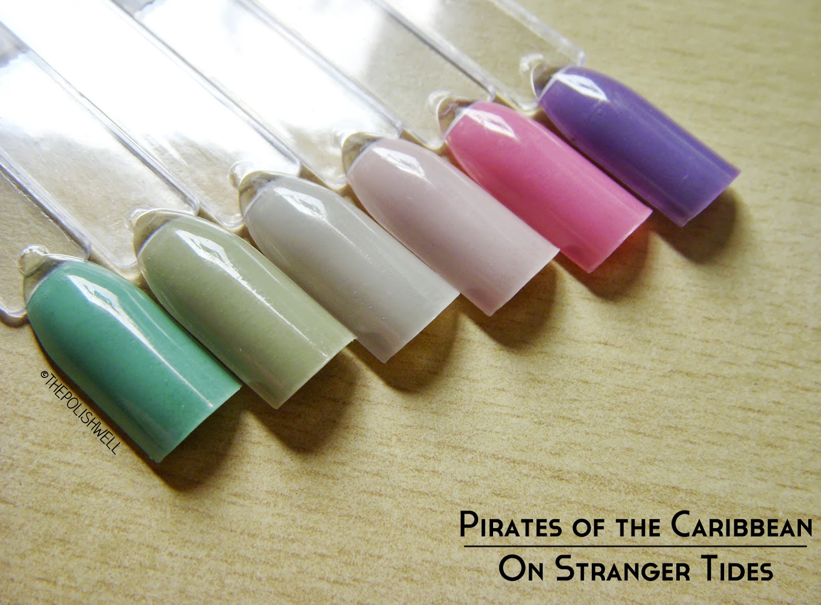
To kickstart the first post after my brief hiatus, I'm happy to say that I've finally gotten my hands on OPI's Pirates of the Caribbean collection! *happy dance* I am not even a fan of pastel colors (I love them but they don't love my skin tone) but I am all gaga over these colors. I believe this is the first time that I've spent slightly more money to get my hands on discontinued colors and I am not regretting it the least bit. Take a look:


opi-mermaids-tears

Mermaid's Tears. 3 thin coats.
Bright but slightly dusty turquoise. You know how much I love turquoises. Make them dusty looking and I'm completely sold. This is also the reason why I spent a couple of bucks more to get this one. Thankfully I didn't have to fork out retail price for it though - OPIs are going at about S$20 through the official retailer *winces*

opi-stranger-tides00

Stranger Tides. 3 thin coats.
A dusty murky green. I can't even begin to say how much I love this.

opi-skull-and-glossbones

Skull and Glossbones. 3 thin coats.
A beautiful light grey with hints of khaki green. I had dismissed this initially because I thought it would look horrid on me but it rocketed to be one of my favorite colors in this collection. The green is just enough to make it wearable and unique. Simply perfection.

opi-steady-as-she-rose

Steady as She Rose. 3 thin coats.
A beautiful lilac shade-shifter. It leans more pink or purple depending on the lighting. Another must-have. Work appropriate too!

opi-sparrow-me-the-drama1

Sparrow Me the Drama. 3 thin coats.
Soft bright pink. I don't really like bright pinks but I make an exception for this - it is bright but dusty enough for my liking.

opi-planks-a-lot

Planks A Lot. 3 thin coats.
A beautiful dusty red-toned purple. I thought it was similar to a-england Guinevere but this is less dusty and brighter.

Yup, I'm seriously in love with all the colors in this collection. If you are a fan of dusty shades, you wouldn't want to miss this collection... well, except the silver shatter perhaps - because it is passé. Although the collection has been discontinued, I believe it is not difficult to find them online on eBay, etc. My advice? Grab them before they become really HTF.

Which color(s) do you like?

 photo xoxo_zpsaad7ebe5.png