Showing posts with label turquoise. Show all posts

China Glaze: Sunsational Cremes


Hola!! After enduring a terrible work week, I thought I would chase away all my sorrows and brighten up my weekend with some neons (pun completely intended)!

Despite all the hype over neon colours in the polish community, I have always avoided neons because I found them too stark and too eye catching for my taste... that is, until I saw the promotional pictures of China Glaze's neon releases for summer 2013. The pastels called to me and my eyes were immediately drawn to the blues and greens. I knew I had to have them. And I was right! Take a look:


Disclaimer 1: I've tried my best-est of best-est to get colour accurate pictures but my camera just refused to handle so much awesomeness. They are brighter in person.

Disclaimer 2: I did not go for any tanning session. The neons are so bright that my camera (and even my eyes) decided that I must have become tanner some what. Silly them.

china-glaze-too-yacht-to-handle

Too Yacht to Handle.
Yup, this is a almost-neon sister of the famous For Audrey. It looks identical to For Audrey but when you put them side by side, you will notice the difference immediately. Too Yacht to Handle is a bajillion times brighter and For Audrey looks really dusty in comparison. Too Yacht to Handle also comes across as being slightly greener. Both are gorgeous in their own right.

china-glaze-highlight-of-my-summmer

Hightlight of My Summer.
A yellow-leaning pastel mint green. I really like it more than I'd expected. It is really bright. I'd thought Illamasqua Nomad is bright but it pales next to Highlight of My Summer. Nomad also has a tinge more blue than Highlight of My Summer. Yup, I do love these two colours.

china-glaze-sun-of-a-peach

Sun of A Peach.
An eye-searing neon peach. Ughhh I love this so much - unexpected favourite. Awesome colour with an awesome name to match. Just plain awesome. I wore it when I dropped by my workplace during my call break (needed to settle some personal matters) and my friend was completely blown by how fluorescent my nails were. Yup it is that bright.

china-glaze-neon-on-on

Neon & On & On.
A neon pink with just a touch of coral. I thought I wouldn't like it but the coral is making me mince my words. Also an unexpected favourite.

china-glaze-bottoms-up

Bottoms Up.
A neon bubblegum pink with a touch of blue. I am sure this would grace Barbie's nails during summer.

china-glaze-thats-shore-bright

That's Shore Bright.
A bright red-leaning purple. The least neon of the collection - is it a neon? Nonetheless, it is still a fun summery colour to sport.

Now, you may have already heard of this already. The formula of these colours are not the nicest to work with. They apply streakily and do not level on their own. I suspect the white in the pastels is not playing nice - as usual. I found that it helped a little to use piCture pOlish's Revolution (meant to be a glitter base but it did not work as well as I had hoped it would be) - the colours applied less patchily that way. Seche Vite did wonders to level out the streakiness as well.

Nonetheless, I am really head-over-heels in love with the sunsational cremes. I liked that they are not the usual highlighter colours. They look less stark that way, don't you agree?

Ever since I have received them in my mail, I've pulled them out countless times to wear them one way or another. Just before I came back to work, I did this completely work-inappropriate mani just because I can ;)

nail-art-china-glaze-sunsational

I started with a white base and randomly sponged on the colours from the Sunsational cremes before topping them with a coat of black shatter. Oh yes, shatters do look good once in a while ;)

So what do you think of the Sunsational cremes?
My personal favourites are Sun of a Peach, Too Yacht to Handle, Highlight of My Summer and Neon & On & On... ok. That's not really helping :P
Which colour is your favourite?

Stay tuned for swatches of the other half of the collection ♥

 photo xoxo_zpsaad7ebe5.png

**Products were provided for our honest review. Please see our disclosure policy for more information.**

essence: Spring / Summer 2013


Happy Sunday everyone! ^_^

I'm feeling particular exuberant today because the air in Singapore has cleared up somewhat in the last two days! The past week had been absolutely horrible. Fires raging in Sumatra caused a huge haze in Singapore with the PSI readings hitting the hazardous range for the first time in years. I have been shuffling to and fro work with a mask because the haze (oh the burning smell!) was giving me a tremendous headache. So I am really relieved that we have some brief respite over the weekends - finally some remotely breathable air! Of course, it would be even better if the government could declare a stop work order next week... yea, I've been told that I am too optimistic :(

Anyway, back to the polishes!

essence Singapore has recently brought in some new shades for spring and summer and they have most generously sent them over for me to share with you. I don't have much to say except that these colors are simply perfect springy/summery shades! Take a look:


essence-ice-ice-baby

Ice, Ice Baby! 4 thin coats.
A squishy off-white jelly that is slightly tinged beige. A little streaky on the first 2 coats but evens out to a perfect glossy finish. It didn't really need the top coat but I top-coated it anyway to speed up the drying process.

essence-peach-cream

Peach & Cream. 3 thin coats.
A soft peach puff with slight pearly shimmer. The pearl finish is not that obvious on the nails after 2 coats so that's a big plus for me - I am not really a fan of that finish. I did not think the color was very flattering on my skin tone under some lighting but I wore it for a few days anyway because it went well with my new turquoise phone casing! :P

essence-thats-what-i-mint

That's What I Mint! 3 thin coats.
A soft pastel mint with very very slight green shimmer (that is clearly not visible on the nails). You know my obsession with blue-greens - this was instantly my favorite. Of course, I wore it for a few days because it matches my phone casing too! ;) It is a tad lighter than China Glaze's For Audrey and they will make a good ombré manicure - I just need to find 3 more shades of turquoise / mint... See! That's why I need more shades of this color in my life. *nods solemnly*

essence-hello-marshmellow

essence-hello-marshmallow2
Hello Marshmallow! 3 thin coats.
A delicate lilac with sprinkles of red and blue shimmer. The shimmers are not that visible on the nails but you can catch a few glimpse of the elusive shimmer where the light hits the nails. It is significantly less similar to China Glaze's Light As Air than I'd thought - more purple and brighter.
essence-flashy-pumpkin

Flashy Pumpkin. 2 thin coats.
An eye-searing tangerine orange. It is so bright that I would even call it neon. Super summery but definitely not for the faint-hearted. Formula for this was exceptionally good. It is very pigmented and I suspect you can get away with one thick coat.

essence-prom-berry

Prom-berry. 2 thin coats.
An intoxicatingly rich vampy purple with very subtle red and blue shimmers. The shimmers are not obvious on the nails but they give the nails a slight glowy look when the nails catch the light.

essence-miss-universe

essence-miss-universe2
Miss Universe. 1 coat over black.
A sheer black base filled with intense sparkly blue and green microflakies.   It is very sheer and will need about three to four coats for full coverage on its own. Very similar to Zoya's Kotori except that it has that extra oomph from the bright green sparkles. Needless to say, I am head over heels in love with this too.


Overall, I am extremely happy with the new colors. The colors, brush and formula do not disappoint. As always, the pastels are slightly streakier than the other colors but they even out fairly nicely on the third coat so I have no complaints there. Plus, at only S$2.90 each, they are a steal - definitely one of my favorite affordable brands.

So, which colors caught your eye? :D

essence cosmetics is currently available at these Watsons stores: Ngee Ann City, City Square Mall, Causeway Point, Lucky Plaza, Plaza Singapura, Bugis Junction, Sun Plaza, JEM, JCube, Parkway Parade, IMM, Lot 1, Anchor Point, Rivervale Mall, Park Lane, Bedok Central, Beautyworld Centre and SMU.


 photo xoxo_zpsaad7ebe5.png

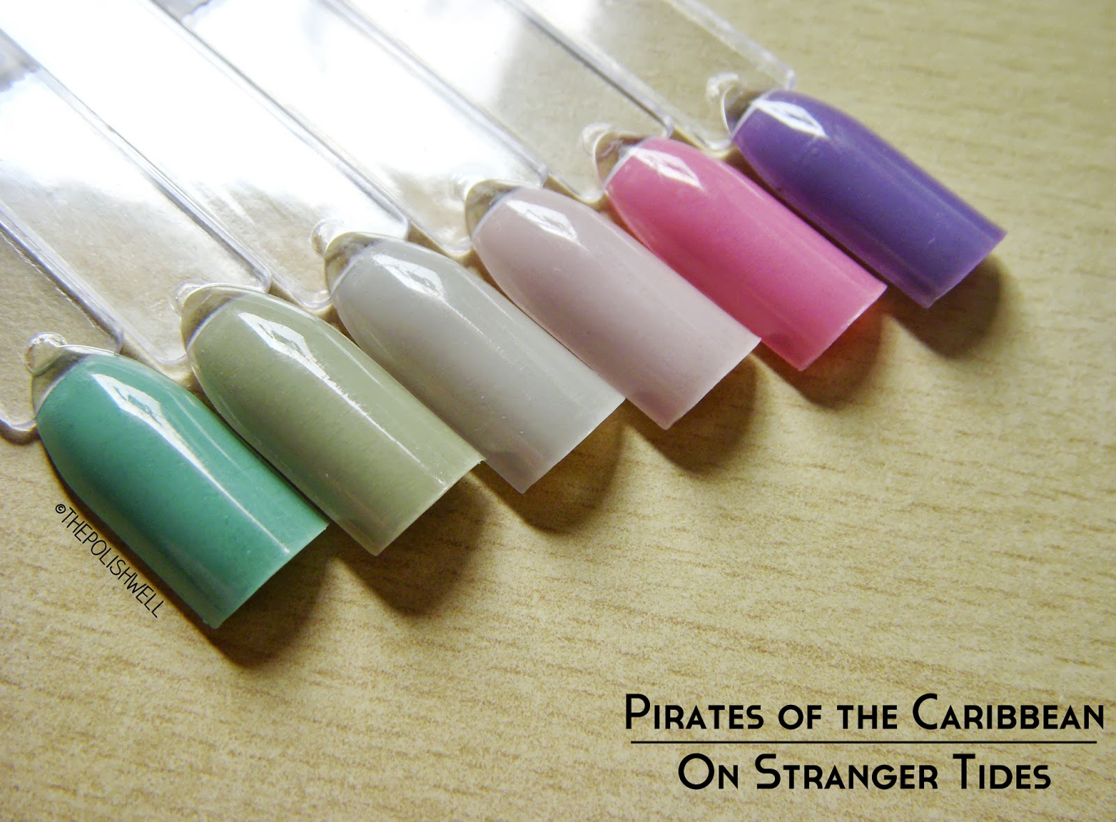
OPI: Pirates of the Caribbean - On Stranger Tides


So, I'd lost my blogging mojo for a few weeks. To be more accurate, I actually bordered on losing interest in nail polishes altogether. Terrifying, I know... But there are many reasons that drove that crazy idea into my head - work, filling orders from my Etsy store and my stubborn insistence to indulge in my other hobbies (eg. manga, TV dramas) till late in the night. With so many things to do, I hardly found the time to do swatches / nail art for the blog *hangs head in shame*

This went on for a few weeks and I finally decided to do something about it:

From now on, my Etsy store will only be opened on the first and last 3 days of each month. 

I thank you for your understanding. Hopefully, this will give me more time over the rest of the weekends to recharge and spend time on other things that I love too - including updating this blog! ♥

To kickstart the first post after my brief hiatus, I'm happy to say that I've finally gotten my hands on OPI's Pirates of the Caribbean collection! *happy dance* I am not even a fan of pastel colors (I love them but they don't love my skin tone) but I am all gaga over these colors. I believe this is the first time that I've spent slightly more money to get my hands on discontinued colors and I am not regretting it the least bit. Take a look:


opi-mermaids-tears

Mermaid's Tears. 3 thin coats.
Bright but slightly dusty turquoise. You know how much I love turquoises. Make them dusty looking and I'm completely sold. This is also the reason why I spent a couple of bucks more to get this one. Thankfully I didn't have to fork out retail price for it though - OPIs are going at about S$20 through the official retailer *winces*

opi-stranger-tides00

Stranger Tides. 3 thin coats.
A dusty murky green. I can't even begin to say how much I love this.

opi-skull-and-glossbones

Skull and Glossbones. 3 thin coats.
A beautiful light grey with hints of khaki green. I had dismissed this initially because I thought it would look horrid on me but it rocketed to be one of my favorite colors in this collection. The green is just enough to make it wearable and unique. Simply perfection.

opi-steady-as-she-rose

Steady as She Rose. 3 thin coats.
A beautiful lilac shade-shifter. It leans more pink or purple depending on the lighting. Another must-have. Work appropriate too!

opi-sparrow-me-the-drama1

Sparrow Me the Drama. 3 thin coats.
Soft bright pink. I don't really like bright pinks but I make an exception for this - it is bright but dusty enough for my liking.

opi-planks-a-lot

Planks A Lot. 3 thin coats.
A beautiful dusty red-toned purple. I thought it was similar to a-england Guinevere but this is less dusty and brighter.

Yup, I'm seriously in love with all the colors in this collection. If you are a fan of dusty shades, you wouldn't want to miss this collection... well, except the silver shatter perhaps - because it is passé. Although the collection has been discontinued, I believe it is not difficult to find them online on eBay, etc. My advice? Grab them before they become really HTF.

Which color(s) do you like?

 photo xoxo_zpsaad7ebe5.png

12 Days of Round-Up: Favorite Color

I must confess, I don't usually have a particular color preference. Admittedly, I had my pink and blue moments back when I was young but I've since grown to love a wider range of colors. But of course, I still find myself having a soft spot for certain colors every now and then.

This year, the official Pantone color of 2012 is Tangerine Tango. Butttt... that color never really caught my eye. >.<
Instead, I've noticed that the newer members of my stash in 2012 are largely... blue-greens! :h

Let's take a look at some of the blue-greens that caught my heart this year:


China Glaze For Audrey. 2 thin coats.
This was the color that started it all off. A friend of mine asked about turquoise nail polishes and I stumbled upon For Audrey. It was not love at first sight because I wasn't sure how it would look on me but I am glad I bought it. It is such a pretty color that I don't really care whether it looks good on me or not. It is one of the colors that I reach for very often - so much so that I have only about half a bottle left now. :$

zoya-bevin02

Zoya Bevin. 2 thin coats.
A soft dusty sage green that is incredibly elegant and beautiful. It wasn't love at first sight either but I fell hopelessly in love with it after seeing it on my friend. :L It is not easy to get Zoyas in Singapore and I nearly went crazy with need. I know that OPI Thanks A Windmillion is very similar but for some reason I really wanted Bevin. It took me months before I was able to satisfy my lemming but it is well worth the wait. It is surprisingly eye-catching for such a soft color and I received many compliments while wearing it. <3

rescue-beauty-lounge-halcyon04

rescue-beauty-lounge-halcyon07
Rescue Beauty Lounge Halcyon. 2 thin coats.
This is another beautiful dusty medium sage green from RBL's Fan Collection for Spring 2012. I know that Aqua Lily was the one that caught the hearts of many others but Halcyon was the first to call my name when I saw swatches of the collection. It took me a lot of willpower to close the browser tab but as fate would have it, a friend of mine accidentally bought an extra and asked if anyone wanted it. The rest was history. I didn't expect to love this as much as I do but, boy, those gold-copper-pink shimmer-flakes are simply stunning. They are subtle but very visible on the nail and catch the light so beautifully. I never knew pink would go so well with green, copper and gold!


China Glaze Exotic Encounters. 2 coats.
A dusty green-leaning teal. By the time the China Glaze On Safari collection came out, I was hopelessly in love with blue-greens so naturally this was a love at first sight for me. Even the holographic glitters in that collection did not distract me from this gorgeous creme.

a-england-galahad03

a-england Galahad. 2 thin coats.
A bright yet slightly-dusty blue-leaning teal this time. Slightly more teal than what my camera picked up. Not a very common shade but I do love it. I also love how pigmented this is. I could get away with one coat if I had been more careful.

cult-nails-living-water00

Cult Nails Living Water. 2 thin coats.
A dark teal jelly with tiny brillant blue and green glitters. I love my darks so there was no way I could leave out this beauty. Even after wearing it so many times, I still lose myself in this dark sparkly polish each time I put it on. :L

What is your favorite color this year?

xoxo,
mich

P.S. Don't forget to enter our year-end giveaway to win amazing polishes from both mainstream and indie brands! Ends 12 Jan 2013.

Femme Fatale Cosmetics: Winter Hyacinth & Hydraxia

Today, I have a new-to-me Aussie indie brand to share with you! Femme Fatale Cosmetics is a home-based business owned by the talented Sophie and specialize in hand-blended mineral based cosmetics. They have a stunning range of eyeshadows (I don't usually pay attention to makeup and such but the colors are really interesting!) and have recently started to offer an impressive range of nail polishes as well!

I first heard of this indie line through the Aussie nail girls on Instagram and couldn't stop drooling over the swatches! Unfortunately, FFC does not offer international shipping so when I heard that Shoppe Eclecticco started carrying their polishes, I quickly jumped on the bandwagon and grabbed these two pretties to try:


Winter Hyacinth. 2 coats over China Glaze For Audrey except for ring finger which has 4 coats on its own.
A beautiful medium turquoise filled with white, rose and fuchsia glitters. Apart from the usual hex glitters, it also contains white diamonds and pink dots that make it so unique. I didn't know that pink and turquoise would go so well together but the I'm hopelessly in love with the color combination. :L The base color is on the sheer side and took about 4 thin coats to be opaque. It is similar to China Glaze's For Audrey - just one or two shade darker and not as bright. Did I mention, I have a thing for teals and turquoises this year? :$

femme-fatale-cosmetics-winter-hyacinth18

femme-fatale-cosmetics-hydraxia07

Hydraxia. 2 coats (dabbed on the second) over one coat of Cult Nails Living Water.
A sheer jelly base of deep sea green full of multiple teal, turquoise, ocean blue, bright blue and soft flecks of yellow in various shapes and sizes.
- Femme Fatale Cosmetics
Yup, a complex polish that I can't even begin to describe adequately. This was the polish that first got my eye on FFC. I saw this on Bec of Nail Gun XS on Instagram and it was love at first sight (she layered it over China Glaze Man Hunt (a beautiful dark blue) here.)! :L I was about to bust out my Cult Nails Time Traveler when I saw Living Water next to it and in that instant, I knew it was The One. The dark teal base and tiny glitters complemented Hydraxia so well as if they were meant for each other! Needless to say, I fell in love all over again. <3

femme-fatale-cosmetics-hydraxia11

The formula on these was very good. The consistency was just right and I did not have to fish around for the glitters. Just a note though: the larger glitters in Winter Hyacinth tend to stay at the bottom of the bottle so it helps to give it a few hard shakes before use.

I must say, having tried these, FFC is definitely on my indie radar now. I'm impressed with the range of colors they offer and their excellent formula. On top of that, they have also gone beyond my expectations by having a very professional packaging for their bottles and website. What more could I ask for?

So, what do you think of these polishes? What other FFC colors caught your eye?

FFC polishes are available for sale in Australia on their website.
If you are living outside Australia, you can grab these beauties from their international stockists such as Shoppe Eclecticco here. Shoppe Eclecticco is also having weekend sale for Aussie indie brands and polishes are at S$1.50 off per bottle! There are only a few FFC polishes available on the site at the time of writing so you better be quick! The next FFC re-stock is tentatively scheduled for mid-end Jan 2013 and will come with new colors - I simply can't wait!!
For more FFC updates, you can follow them on Facebook or Twitter!

xoxo,
mich

HARE Polish: The First Collection (Reformulated)

Ok... it is no secret that I am a huge HARE polish fan right? Right. :e
And so it should not come as a surprise that I did a mega haul of shame during her last few Etsy restocks, right?


In my defense, my brain was malfunctioning during that period (revision for exams!) and I badly needed some retail therapy... Oh, scrap that. Who am I kidding?? There is no way I could miss HARE polish's restock! :brow

So let's start off with some swatches of the reformulated First Collection, shall we?

hare-polish-a-positive0

A Positive. 2 coats over 2 coats of OPI Houston, We Have A Purple.
A super squishy bright magenta red jelly filled with a mix of silver hexes of three different sizes. The base color was a little sheer so I decided to layer this over HWHAP lest the silver hexes cover up the entire base color if I try to build it up to opacity on its own. I had contemplated skipping this but I'm really glad I didn't. :L If you love jelly glitters, this will be right up your alley too.

hare-polish-a-positive6

hare-polish-pegasus3

Pegasus. 2 coats over China Glaze Light As Air on the first three fingers & 2 coats on its own on the pinkie.
Another silver hex glitter mix but in a soft lilac base this time. The silver hexes are colored white by the base color, giving it an unexpectedly delicate and feminine look. :angel I'm so glad I managed to snag this one after lemming for it for so long!

hare-polish-pegasus9

hare-polish-bisbee2

Bisbee. 3 coats on its own.
And finally, the star of the collection - this little bunny was wiped out within seconds in each of the restocks and I was really lucky to get it before it was gone. It was literally the fastest shopping I had ever done - I was in and checking out in under a minute. The adrenaline was still coursing through my body long after the damage was done.... Oops, I digressed.
Bisbee is a bright green-leaning turquoise filled with a mix of gold hexes of different sizes. I had some problems with the larger glitters clumping and curling a wee bit but nothing a little prodding and manipulating can't solve. In any case, how could I hold it against a pretty polish like Bisbee? You know you want it too. ;)

hare-polish-bisbee10

There is one other polish from the First Collection, Archipelago, but it is not ready to be included in this reformulated collection. :( I am hoping that Nikole will be able to find the right materials to make it once again! It's a stunning beauty and I would hate to miss it.

So, what do you think of HARE polish's First Collection?
Stay tuned for more swatches soon!

xoxo,
mich