Showing posts with label OPI. Show all posts

Chocolate dipped w/ Candy Nail Art & How To

Hello dear readers!

It's been a long time since I've done nail art...

So one day I was at San Francisco's Ichiban Kan store and stumbled upon the deco section. I saw all those candy deco parts and it occurred to me that I could use a little baggie of fake candy sprinkles on my nails and achieve a 3D type of nail art.

So here's the final result:
Note: Scroll down for instructions on how to do it yourself ;)
 

1. Start with a cream finish white or pastel colored nail polish as the base.
I used Orly - Cotton Candy

2. Use a dark brown nail polish or acrylic paint and paint on the tips of the nails as if you've dipped them in chocolate. The dripping effect depends on the length of your nails... there's no right or wrong way to do this. I used OPI - Suzi Says Da! for it's chocolate-like color.

3. I added little dots of clear nail polish and placed the fake candy sprinkles randomly.
*You can get these on Etsy, search for "deco fake candy sprinkles"
**You can also make these sprinkles yourself with polymer clay. I found a how-to video here.
***If you are not into 3D nail art, you can use acrylic paint or nail polish in pastel colors and draw little lines to emulate the small candy.

4. Apply 1 or 2 layers of clear topcoat to protect your nail art. I thought the candy parts would fall off right away, but I was wrong... they can last a week or more but believe me... it is not the most practical nail art to wear everyday... I had such a hard time washing my hair XD

Here's an extra pic that I posted on my Bunny Nails Facebook (feel free to add me) of me wearing this nail art.

What do you think of this nail art? Would you add the candy sprinkles or paint them instead?

♥ ♥Thank you so much for reading♥ ♥

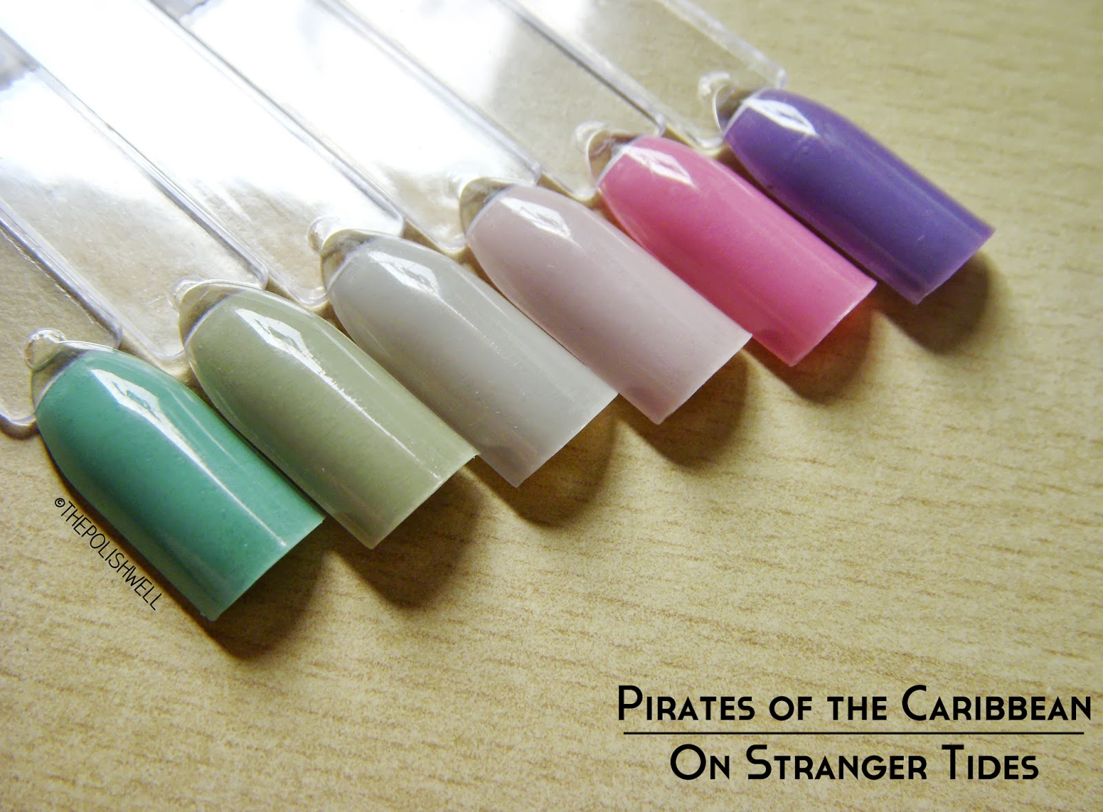
OPI: Pirates of the Caribbean - On Stranger Tides


So, I'd lost my blogging mojo for a few weeks. To be more accurate, I actually bordered on losing interest in nail polishes altogether. Terrifying, I know... But there are many reasons that drove that crazy idea into my head - work, filling orders from my Etsy store and my stubborn insistence to indulge in my other hobbies (eg. manga, TV dramas) till late in the night. With so many things to do, I hardly found the time to do swatches / nail art for the blog *hangs head in shame*

This went on for a few weeks and I finally decided to do something about it:

From now on, my Etsy store will only be opened on the first and last 3 days of each month. 

I thank you for your understanding. Hopefully, this will give me more time over the rest of the weekends to recharge and spend time on other things that I love too - including updating this blog! ♥

To kickstart the first post after my brief hiatus, I'm happy to say that I've finally gotten my hands on OPI's Pirates of the Caribbean collection! *happy dance* I am not even a fan of pastel colors (I love them but they don't love my skin tone) but I am all gaga over these colors. I believe this is the first time that I've spent slightly more money to get my hands on discontinued colors and I am not regretting it the least bit. Take a look:


opi-mermaids-tears

Mermaid's Tears. 3 thin coats.
Bright but slightly dusty turquoise. You know how much I love turquoises. Make them dusty looking and I'm completely sold. This is also the reason why I spent a couple of bucks more to get this one. Thankfully I didn't have to fork out retail price for it though - OPIs are going at about S$20 through the official retailer *winces*

opi-stranger-tides00

Stranger Tides. 3 thin coats.
A dusty murky green. I can't even begin to say how much I love this.

opi-skull-and-glossbones

Skull and Glossbones. 3 thin coats.
A beautiful light grey with hints of khaki green. I had dismissed this initially because I thought it would look horrid on me but it rocketed to be one of my favorite colors in this collection. The green is just enough to make it wearable and unique. Simply perfection.

opi-steady-as-she-rose

Steady as She Rose. 3 thin coats.
A beautiful lilac shade-shifter. It leans more pink or purple depending on the lighting. Another must-have. Work appropriate too!

opi-sparrow-me-the-drama1

Sparrow Me the Drama. 3 thin coats.
Soft bright pink. I don't really like bright pinks but I make an exception for this - it is bright but dusty enough for my liking.

opi-planks-a-lot

Planks A Lot. 3 thin coats.
A beautiful dusty red-toned purple. I thought it was similar to a-england Guinevere but this is less dusty and brighter.

Yup, I'm seriously in love with all the colors in this collection. If you are a fan of dusty shades, you wouldn't want to miss this collection... well, except the silver shatter perhaps - because it is passé. Although the collection has been discontinued, I believe it is not difficult to find them online on eBay, etc. My advice? Grab them before they become really HTF.

Which color(s) do you like?

 photo xoxo_zpsaad7ebe5.png

OPI Venus Di Violet - Swatches and Review

Hello dear readers!

I want to show you a few swatches of OPI Venus Di violet. This nail polish was part of the Italian Collection and then re-released as part of the OPI Colorcopia Collection.
Venus Di Violet is a nail polish that I got from a blog sale. 
(Click here for a post about this haul)
 
As you can see, it is a light pink color with pearl finish. It has a subtle violet duo chrome shimmer.
For the swatches, I used 2 coats for opacity. In the picture it shows a bit of streaks, but not in person. The formula is sheer, 2-3 coats are necessary for opacity.

As far as I know, this color has been discontinued by OPI, but is still easy to find online.


I used this nail color as the base for my Bunny & Cherry Blossom nails.
(Click here to access the post about this nail art)

Would you wear Venus Di Violet by itself or would you add some nail art as well?
If so, which type of nail art would you do?

♥♥Thank you so much for reading♥♥

Sakura Bunny

Hello dear readers!

Easter is a couple days away and I was planning nail art for this occasion. I was thinking about Easter eggs, peeps or chocolate bunnies. When I decided that I wanted to include bunnies into the design, the image of bunnies viewing cherry blossoms was the first thing that came to my mind. The Japanese culture lover that I am could not resist doing another nail art inspired in this beautiful symbol of  Japan

For those who may not know it, 花見 hanami (flower viewing) is a Japanese tradition in which people gather and eat under a cherry blossom tree to observe the ephemeral beauty of sakura. 

(Pictures can be enlarged)
Here's what I used for this nail art:
-Base: OPI Venus di Violet
-Stamping plates: XL O (for background) QA21 (tree branches) and HD A & B (bunnies)
-Stamping nail polishes: Ulta - Grape Escape, Kleancolor - Dark Brown and Verity - White
-Cherry blossom nail stickers
うさぎ花見

Falling in love...


I hope you like this manicure as much as I did ;)

♥♥Thank you so much for reading♥♥

OPI St. Petersburgundy - Review and Swatches

Hello dear readers!

Today I would like to show you swatches of OPI St. Petersburgundy that I wore a couple weeks ago.
Red is not a color I wear that often, probably once a year at most, but a friend of mine suggested that I should wear a red nail polish more often because it's supposed to look more sexy ;) ... anyway, I tried to be more daring and wore this nail polish without any nail art.


St. Petersburgundy is a nail polish that I bought from a blogsale. 
(Click here for a post about this haul)
It belongs to the 2007 OPI Russian collection.

Now onto the review... This is a dark red color that is very sheer, jelly like. I had to apply 3 coats for opacity. I couldn't wait to let dry in between coats and it resulted in serious bubbling... it was my fault though, not the formula. 

Extra pics...


Ladies, do you wear red nail polish more often than me? 

♥ ♥Thank you so much for reading♥ ♥

Comparison: Revlon Royal & OPI Eurso Euro

Here's a quickie comparison between Revlon Royal and OPI OPI... Eurso Euro:


Sorry for the slightly dark lighting. This is the only way that I can photograph these accurately.

As you can see, the colors are really close but not identical. OPI... Eurso Euro is a tad more red-toned as compared to Revlon Royal. Royal is also slightly brighter and more vibrant.

If I really have to choose between one of them (heaven forbid), I will go for Revlon Royal. It is more versatile - think jelly sandwich, etc! <3

Which do you prefer?

xoxo,
mich

OPI: Euro Centrale 2013

Yay! I am finally done going through the pre-orders so I took some time to play with some of the pretties that I've got this week!

Presenting... *drumroll*... my picks from OPI's Euro Centrale collection!


Oh my... look at those blues!! They stole my heart the minute I saw them in the preview picture. :L

opi-my-vampire-is-buff

My Vampire Is Buff. 3 thin coats.
A pretty pale yellow-toned beige. A bit more beige than what this picture shows - closer to the color in the first picture. I don't usually buy shades like these (especially yellows) but I love how soft and delicate this is!

opi-you're-such-a-budapest

opi-you're-such-a-budapest1
You're Such A Budapest. 3 thin coats.
A pretty periwinkle with very subtle blue and pink shimmer. You can see the shimmer in the bottle (pic below) but it doesn't show up very much on the nails (close-up on left). Oh and I absolutely love the name for this one - too cute!
opi-you're-such-a-budapest2

opi-can't-find-my-czechbook

Can't Find My Czechbook. 2 coats.
A gorgeous aqua blue that is both bright and dusty at the same time. It is dustier looking than what the picture shows - closer to what the swatch stick shows. Definitely more gorgeous than what I can capture. Love the name too!

opi-eurso-euro

OPI... Eurso Euro. 2 coats.
A vibrant deep cobalt blue - another stunner. I had a super hard time trying to photograph this - somehow my camera picks up the vibrance but couldn't handle the richness of the blue. The first picture shows how rich and deep the cobalt is.
And, yes this is almost an exact dupe of a hot favorite: Revlon Royal. Almost... but not really. I wanted to do a comparison but I realized I've used up my Revlon. I need to head out and get one asap. On the swatch sticks, Eurso Euro is slightly more red-toned and is less jelly/squishy as compared to Royal (let me know if you want a picture). They do smell the same though - probably because they used the same ingredient.

opi-i-saw-u-saw-we-saw-warsaw

I Saw... U Saw... We Saw... Warsaw. 2 coats.
Ahhh... a rich midnight blue. Another head-turner. No way I could pass it up.

Formula-wise... I did have some trouble with certain shades.
My Vampire Is Buff and You're Such A Budapest were slightly thin and streaky. I had to use three coats and even then, I am not entirely satisfied with how they look.
OPI... Eurso Euro is a crelly (creme-jelly) so application was a bit tricky as well. Too much exposure to the air and it will start to thicken up. If that happens, cap the bottle and give it a little shake before painting again.
Warsaw and Can't Find My Czechbook applied beautifully.

So what do you think of these colors? Which Euro Centrale colors caught your eye?

xoxo,
mich

12 Days of Round-Up: Upcoming Collections in 2013

Phew! I've just survived my first day of work training and it was more tiring than I'd thought. The best part was... I didn't even have any work to do! But really, sitting at the desk doing nothing for hours straight is really exhausting and no fun at all. I sure hope tomorrow will be slightly better!

Anyway, let's jump straight to today's post before I call it a night! As with our usual tradition, here's a round-up of some of the new/upcoming collections in 2013!

Disclaimer: Pictures are taken from everything2k unless specified otherwise!

OPI Mariah Carey

I've already posted about the liquid sand polishes from this collection but OPI also has something for those who are not loving the gritty texture! Creme, glitter and shimmers - now that's something for everyone! I love how the colors are very rich and diva-esque.

Zoya Lovely

source: zoya
Ahh... one of the early spring collections that is already available! This collection features pastel hues in cremes and heavy shimmers. I've read that the formula is slightly tricky for these though. That aside, Neely (was there ever any doubt) and Julie are calling my name.

Orly Hope and Freedom

I am not sure if these are already available but I believe these are already available through some etailers in Singapore. Of course, Peaceful Opposition stole all the limelight with the white-based glitters (swatch here). High On Hope looks gorgeous in the bottle too but not so much on the nails... Still rather pretty though! I haven't seen swatches of the other colors yet but Boho Bonnet and Coachella Dweller are pretty too and worth a look if you don't already have similar colors.

China Glaze Avant Garden

source: melva@nailvibe
Another spring collection that is already available in Singapore through etailers. I'm not too sure about the "Brights" half of the collection (on the left of the picture) but I'm loving the pastels. Not sure if there are dupes for them though.

OPI Eurocentrale

source: opi
Yessssssss! Oh how I want these so bad! If you have missed it, hop over now to see swatches of the blues by Manicurator - they are to-die-for!!!! I am also eyeing BudaPest and Polka.com (how cute is that name?!) It's been a while since I've been so excited about so many colors in an OPI collection - I feel so much love for OPI now.

ETA: February 2013

Butter London Spring 2013

source: bagfulofnotions
Pastels. Omg. They look so so pretty but I don't know if they will look any good on my skintone. That peach and turquoise are making me drool.

Essie Spring 2013

Last but not least, we also have a spring collection from Essie! I'm loving the three colors at the bottom! So pretty! Is there anything like Maximillian already?

ETA: March 2013

Moving away from the Spring collections, here are some of the other collections that are coming out in 2013:

OPI Oz

source: opi
An Oz collection with no reds or emeralds?! I am just a wee bit disappointed. But then again, the new Oz movie is adapted from the novel and not exactly what we have seen in the past so maybe the reds don't come into the picture so much. The glitters are interesting but I don't quite know how I feel about the soft shades. The NYC Ballet collection has set a pretty high bar!

ETA: March 2013

China Glaze Glitz

source: chinaglaze

Gorgeous 3D glitters, combined with black Bitz ’N Pieces create a Mosaic Masterpiece on nails.
Yes, this collection features some sparkly glitters mixed with black hexes and bar glitters! Now that is definitely edgy alright! I haven't seen swatches of these but they look pretty promising in the promo shots. I hope it won't turn out too much like Whirled Away - it just didn't look quite right to me...

China Glaze Hologlam

Yes, this is a repost but I couldn't resist including this again! The swatches seen at Polish Galore look really promising but recent swatches that appeared on Instagram seem otherwise... You can check them out here and here. I'm really hoping that CG don't disappoint me!!

ETA: March 2013

China Glaze NEONS On The Shore

Create waves with NEONS On The Shore. Twelve new SUN-sational crèmes and jellies.
Yes you read that right - JELLIES. I wonder how neon jellies look like. The teal looks really pretty in the promo shots though!

ETA: April 2013

Sooo... what do you think of these? Which ones are you eyeing?

xoxo,
mich

P.S. Don't forget to enter our year-end giveaway to win amazing polishes from both mainstream and indie brands! Ends 12 Jan 2013.

12 Days of Round-Up: Trends in 2013

It's 2013!! Did you have a great New Year's Day? :party

To usher in the new year, I will be continuing the 12 days of round-up series by covering some of the polishes to look out for in 2013! :e Of course, the materials I have to work with are very limited so this will only be a small preview of what is in store for us this year.

OPI Liquid Sand / China Glaze Texture / Zoya PixieDust

source: OPI
source: everything2k
source: zoya; swatches at manicurator
Very fine glitters that dry matte and gritty. Yup, all three of them are putting out these glitters in different colors! Heh.. makes one wonder if all the companies have a meeting at the start of the year to decide on the trends for the year. xD

I am most fascinated by how the polish base seemingly disappears to leave behind the glitters. That aside, I am not normally a fan of gritty nails so I don't quite know if I will like these. Swatches for the OPI and Zoya glitters are already floating around and bloggers agree that they are not as gritty as they look so I may give it a shot. Of these, I have to say that I prefer the OPI colors - kudos to them for adding different glitters to make it more interesting and varied. And Stay the Night looks absolutely stunning - I have a weakness for red and black.

Nails Inc Leather Effect

source: nailsinc
From The PolishAholic's swatches, especially the sun pic, the leather effect polish appears somewhat similar to the liquid sand / pixie dust glitters but Jen noted that it was less gritty - perhaps due to the creamier base? In any case, I am loving their packaging - black leather with skulls? Yes please! \m/

From what we can see so far, it appears that the companies are going big on texture for the new year!
What do you think of this trend? Yay or nay?

xoxo,
mich

P.S. Don't forget to enter our year-end giveaway to win amazing polishes from both mainstream and indie brands! Ends 12 Jan 2013.